Visual needs
Visual needs
Introduction
Visual impairments can affect people to different degrees, including:
-
Blind people who are sightless with no light perception.
-
Those with only slight peripheral vision.
-
People with light perception but a colour deficiency ('colour blindness').
-
Temporary impairments such as distraction or glare.
Some people will use a screen magnifier, screen reader and/or Braille display to use technology. Some people may also require travel, mobility and navigational assistance.
Nearly 2 million people in the UK are blind or partially sighted. Only one-third of people registered blind or partially sighted are in paid work.
Over one-third (44%) of blind or partially sighted people also have depression, making it the most common secondary condition for those with sight loss.
Examples of visual impairments
The following table lists examples of visual impairments in three columns (permanent, temporary and situational).
| Permanent | Temporary | Situational |
|---|---|---|
| Blindness | Cataract (cloudy lenses) | Glare |
| Glaucoma (damaged optic nerve) | Refractive errors (long/short sight, double vision) | Distraction (visual complexity) |
| Macular degeneration (effecting central part of the retina) |
How to design for visual needs
In addressing some of the design tips below, we make it easier for everyone to use our apps.
Readability and contrast
Use the
Use a colour contrast of at least 4.5:1. Use a
Design for assistive technology
Use semantic headings and HTML tags to structure the app. Using correct HTML will allow assistive technologies to read an overview of the page when landmarks, regions and headings are implemented appropriately.
Make sure that all elements have correct labels and providealt
(or alternative) text when necessary. Good labelling helps all users, such as during issues with downloading parts of the web page.
A linear and logical layout can help users when navigating using a keyboard or when using assistive technologies.
Help convey meanings
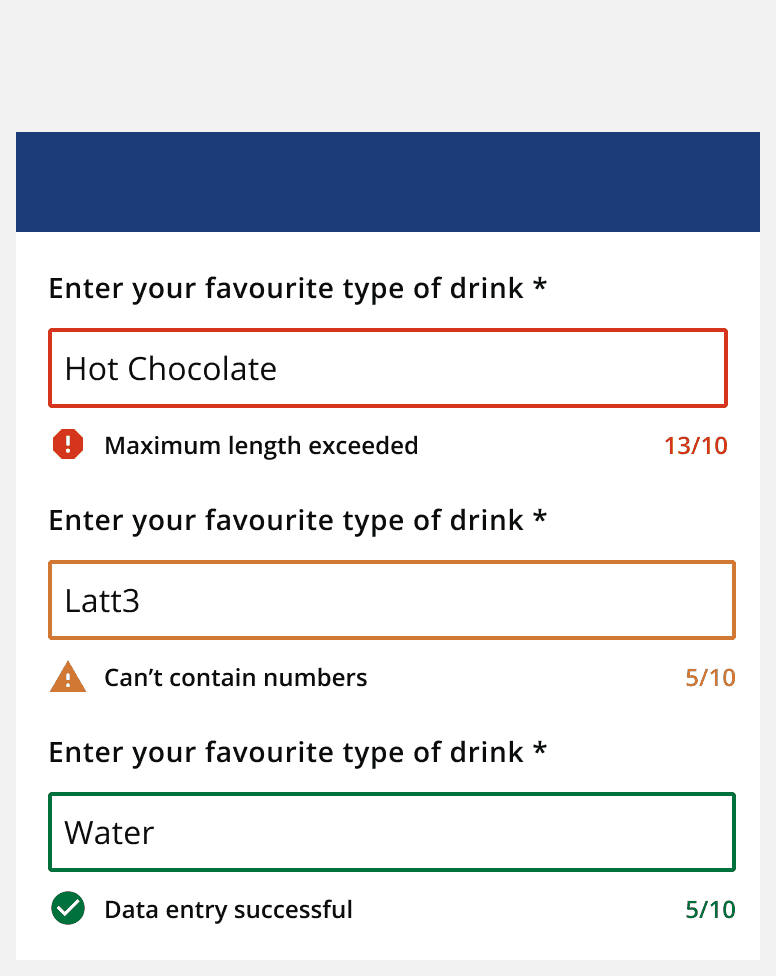
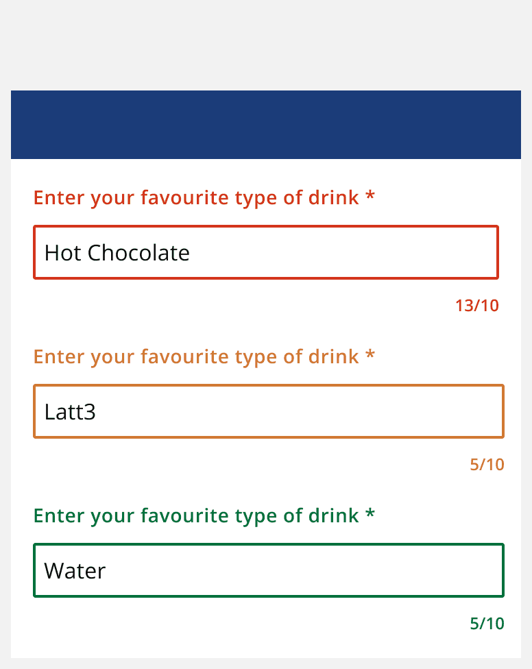
Don’t rely on

