Skip to page content

Introduction

An example of the page header component.

Interactive example

When to use

Use a page header to display an introduction to the content of the page. Add additional elements to provide actions, navigation or inputs at the page level.
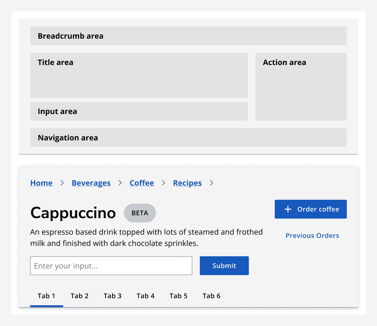
A diagram showing the positioning of the content areas within a page header. The content areas are a breadcrumb area, a title area, an action area, an input area, and a navigation area. 
The anatomy of a page header that includes areas for breadcrumbs, titling, actions, inputs and additional navigation.

With action

Use buttons when you need to provide actions that affect all content on the page, for example to filter or to add a new record. Only use one primary button per page header. Use any type of button within the page header’s interaction area.

With input

Include an input field to search or filter data displayed on the page. Don’t overload the input area with components, consider placing them in the page content instead.

With breadcrumb navigation

Use a breadcrumb to show the current page’s position in the app’s hierarchy or show a link to the parent page.

With tab navigation

Use tabs if the content grouped by the header can be split into distinct categories.

With stepper

Use a stepper to show progress through a multi-step process.

When not to use

Don’t use the page header to include global actions or global navigation, instead use the top navigation or side navigation .
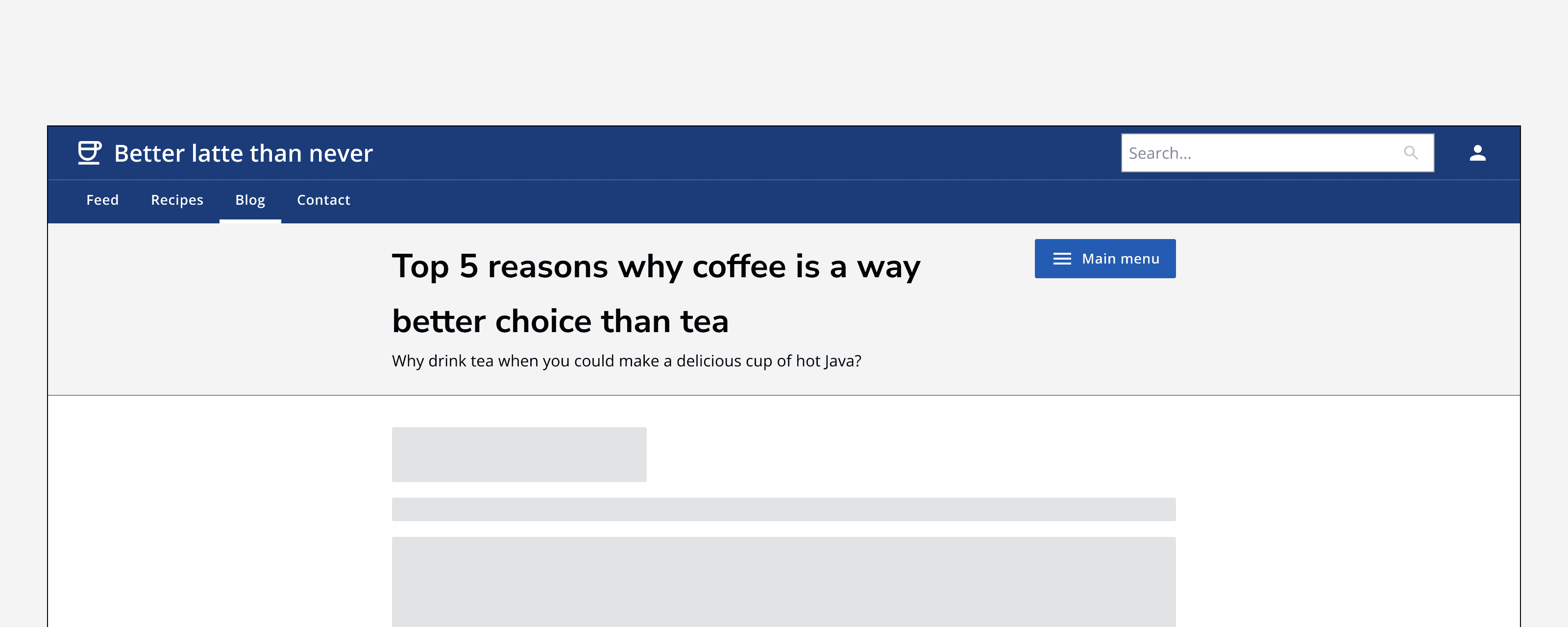
An example app called ‘Better latte than never’ that displays a page titled ‘Top 5 reasons why coffee is a way better choice than tea’. The page’s page header contains an action button titled ‘Main menu’.
Don‘t use global actions within a page header.

Sizing

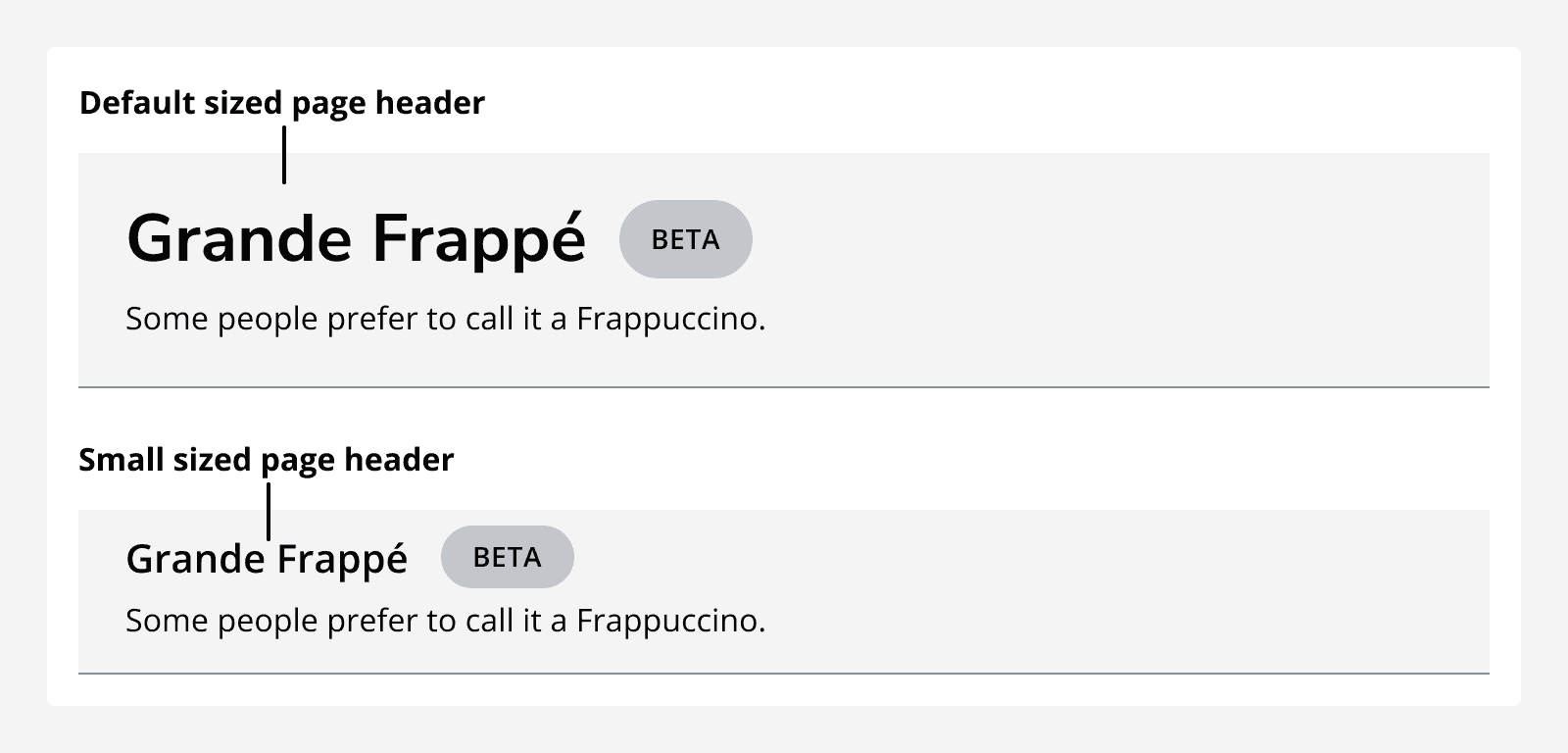
A default sized page header with a large title that says ‘Grande Frappé’ and small sized page header with the same title displayed much smaller.
An example of default and small sized page headers.

Set the width of the page header to match the width of the page’s main content.
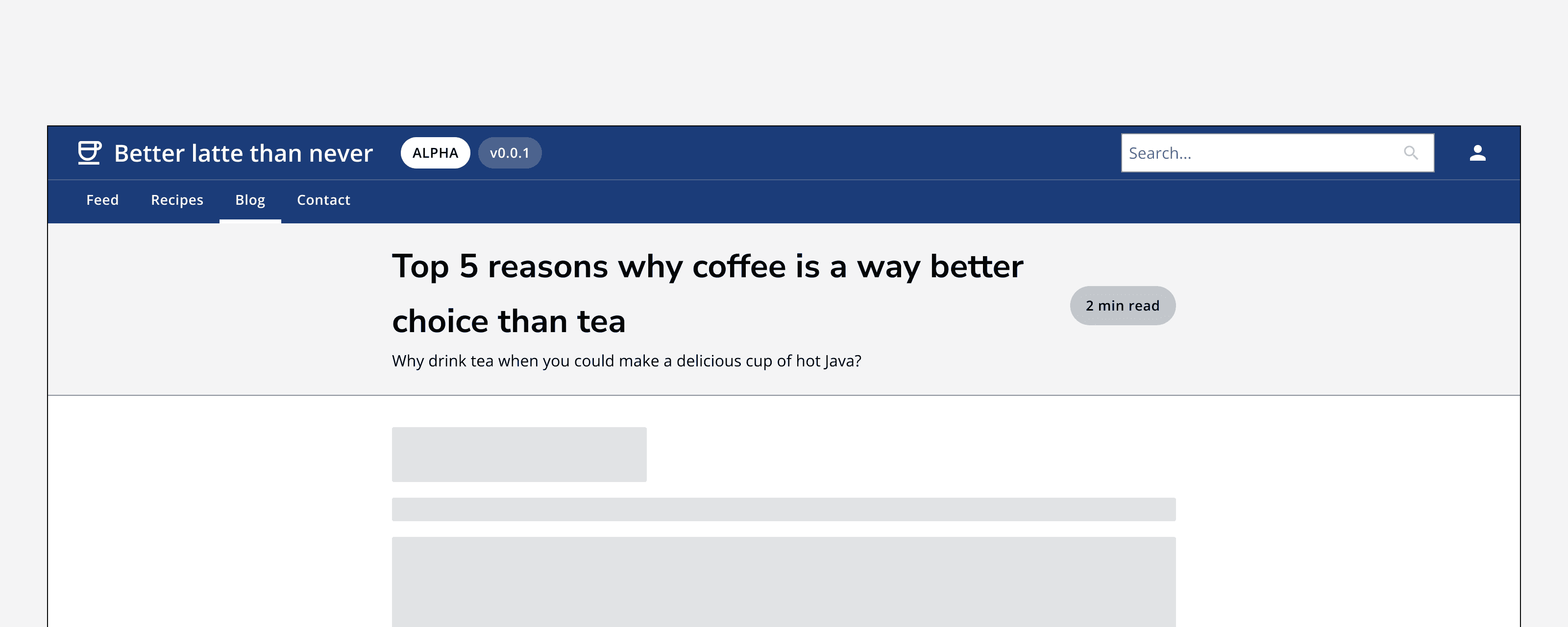
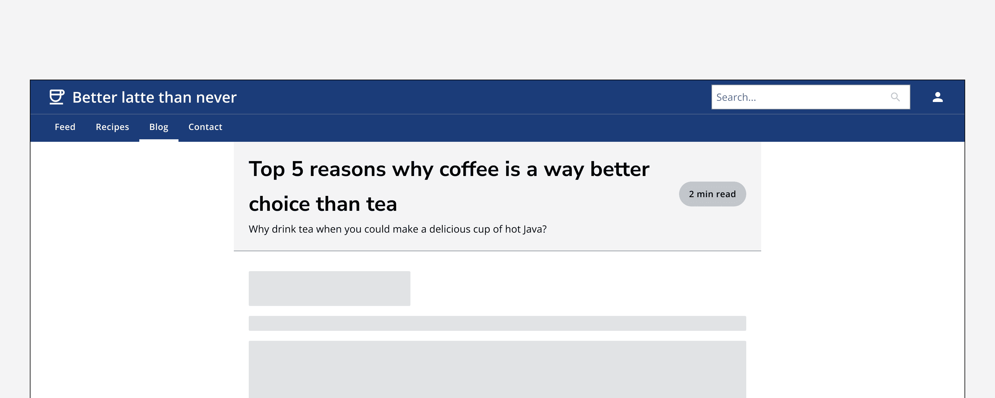
An example app titled ‘Better latte than never’ showing a page called ‘Top 5 reasons why coffee is better than tea’ with a page header that spans the full width of the content area.
Set the width of the page header to fill the page’s main content area.
An example app titled ‘Better latte than never’ showing a page called ‘Top 5 reasons why coffee is better than tea’ with a page header that is indented from the page margins to align with the page’s example content.
Don’t set the width of the page header to align with content. The page header content will align to your content container automatically.

Layout and placement

Sticky scroll

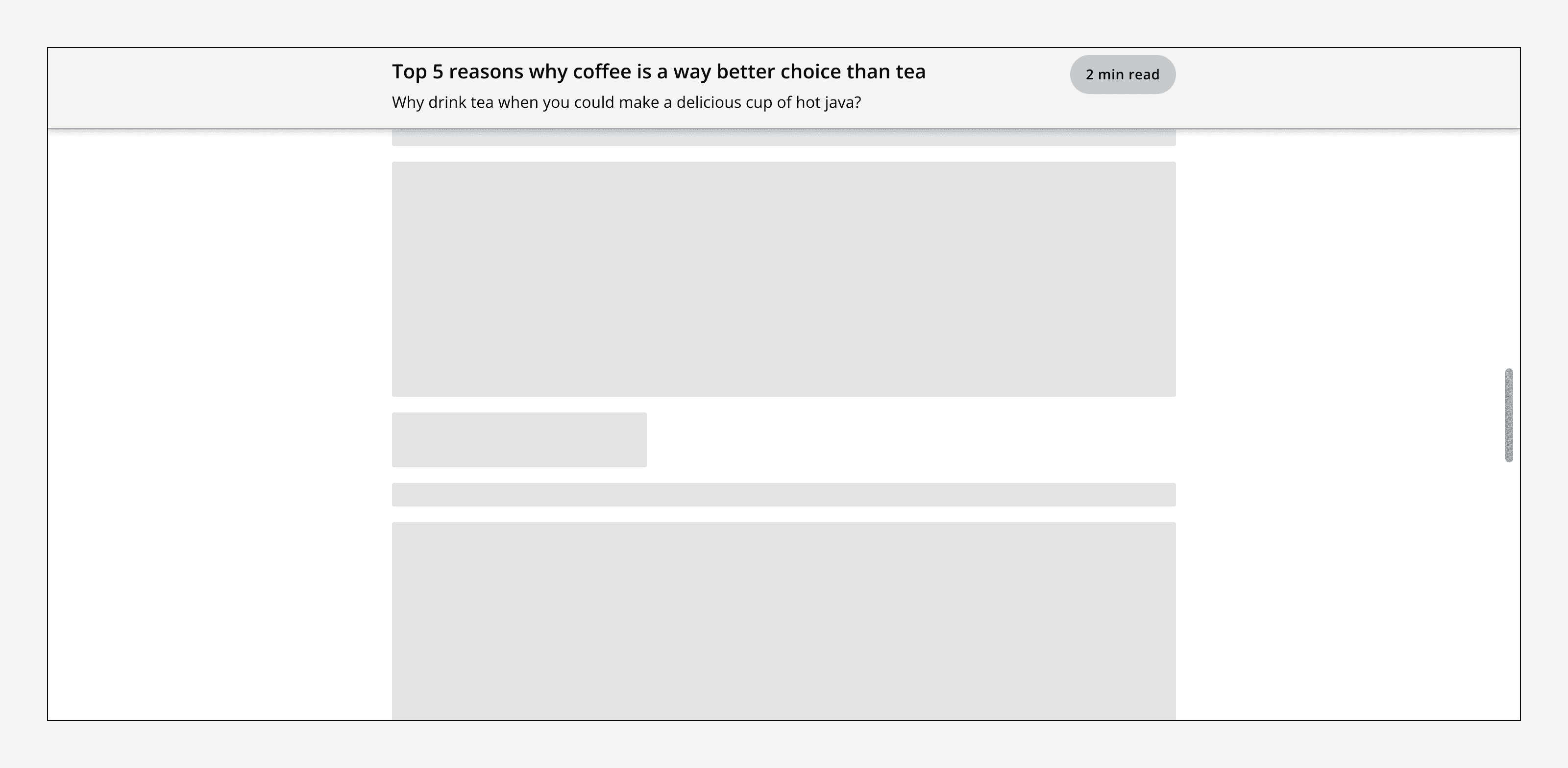
Set the page header to stick to the top of the screen if you need it to be visible when scrolling. Otherwise, set it to scroll with content to maximise available space for content.
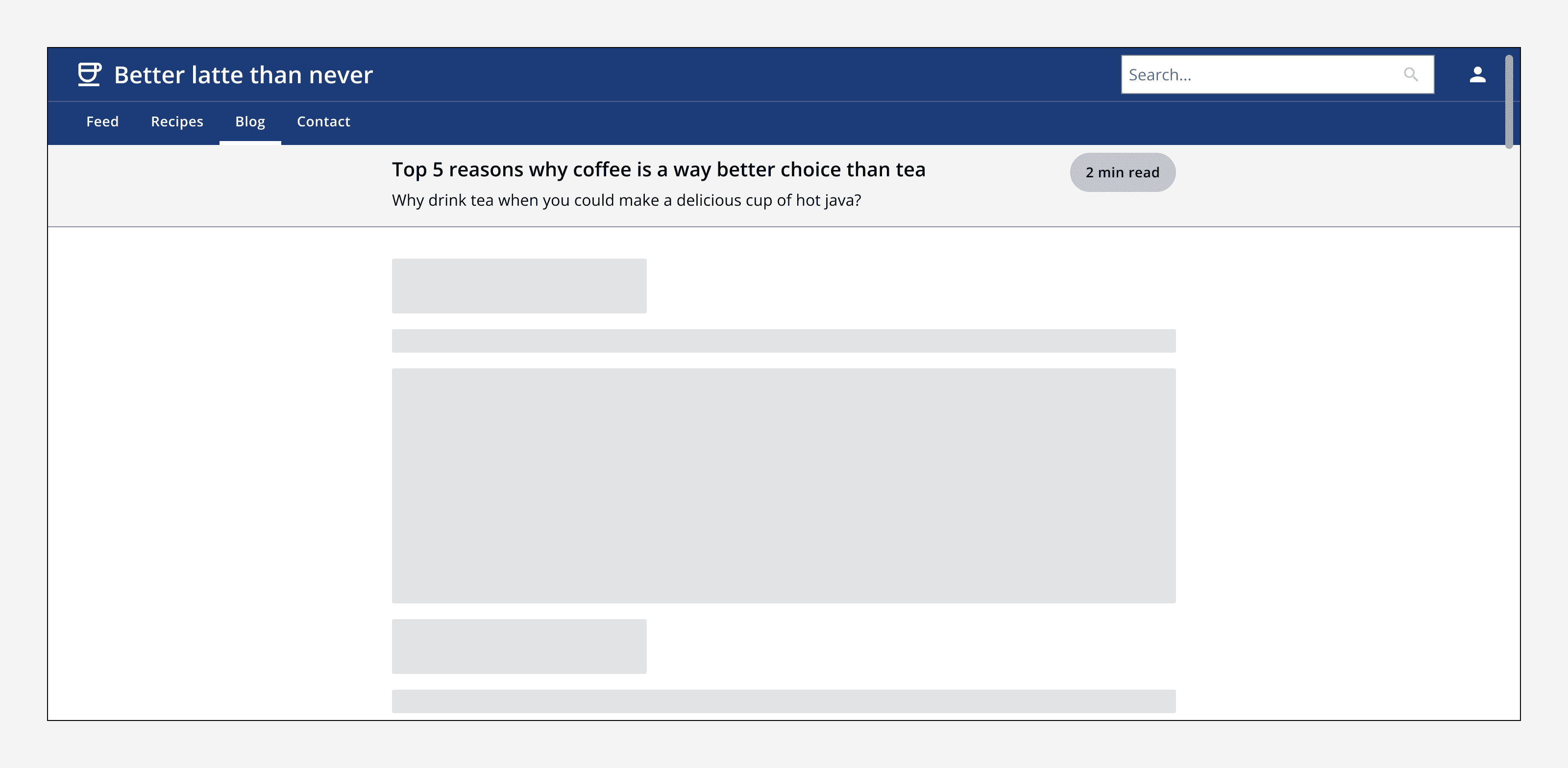
An example app title ‘better latte than never’ that shows the top navigation component at the top of the screen, a page header below it, and some example content below that.
The page header sits at the top of the page when scrolled to the top.
An example app that is scrolled partway down the page. A page header is displayed stuck to the top of the screen and overlaying other example content.
A sticky page header stays at the top of the screen when scrolling down the page.

Alignment

Align the page header either to the left, centre or full-width to match the rest of the content on the page.
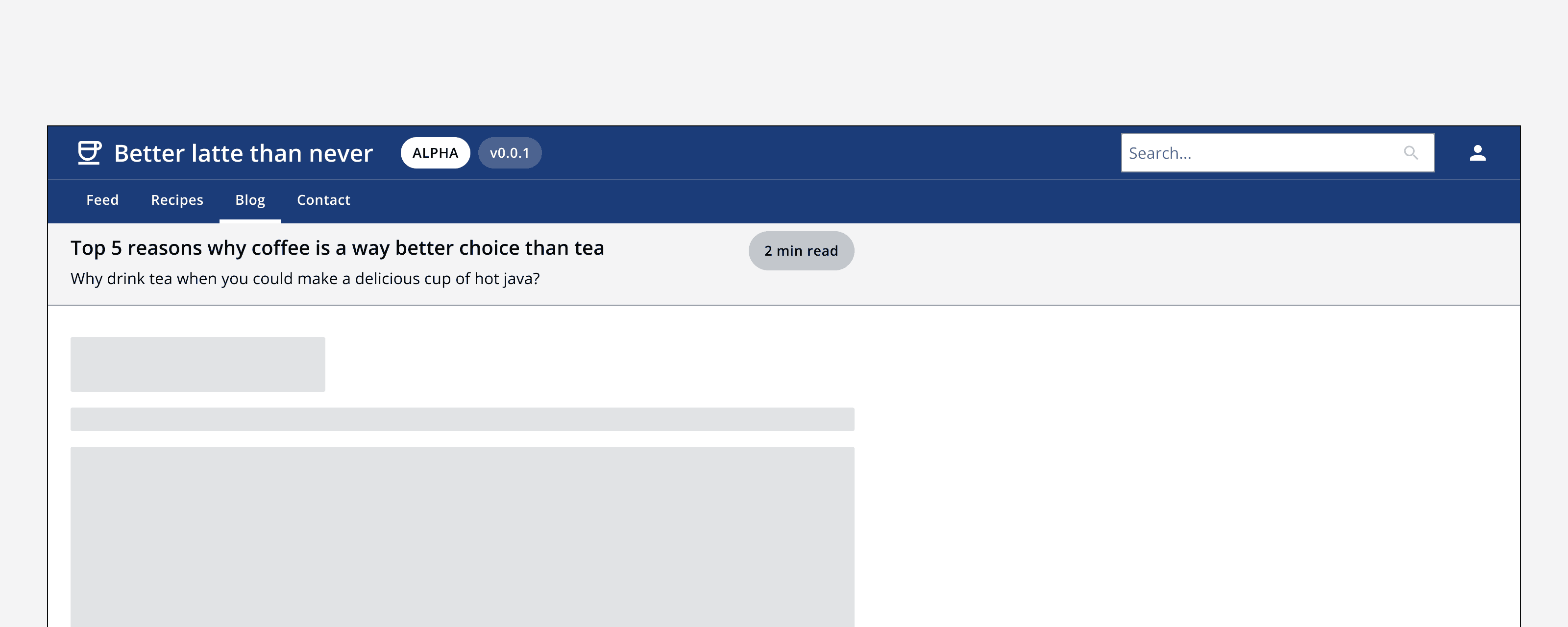
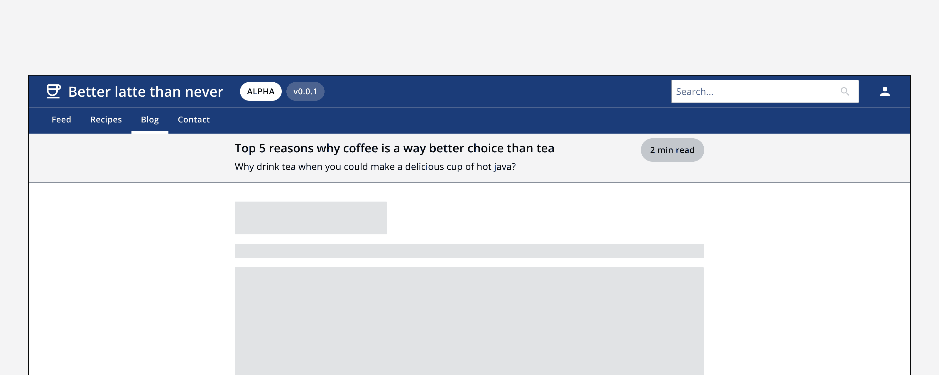
An example app that shows a page header and some example content. The page header’s title, description and action button are aligned to the left hand side of the screen, and the example page content below is also aligned to the left of the screen.
Use left alignment to position page header content to the left of the page container.
An example app that shows a page header and some example content. The page header’s title, description and action button are aligned to the centre of the screen, and the example page content below is also aligned to the centre of the screen.
Use centred alignment to position page header content to the middle of the page container.
An example app that shows a page header and some example content. The page header’s content spans the full screen width with its title and description aligned to the left margin and its action button aligned to the right margin. The example page content below is aligned to the centre of the screen.
Use full-width to align page header content to the left and right margins of the page container.

Don’t align a page header’s content differently to how the rest of the page content is aligned.
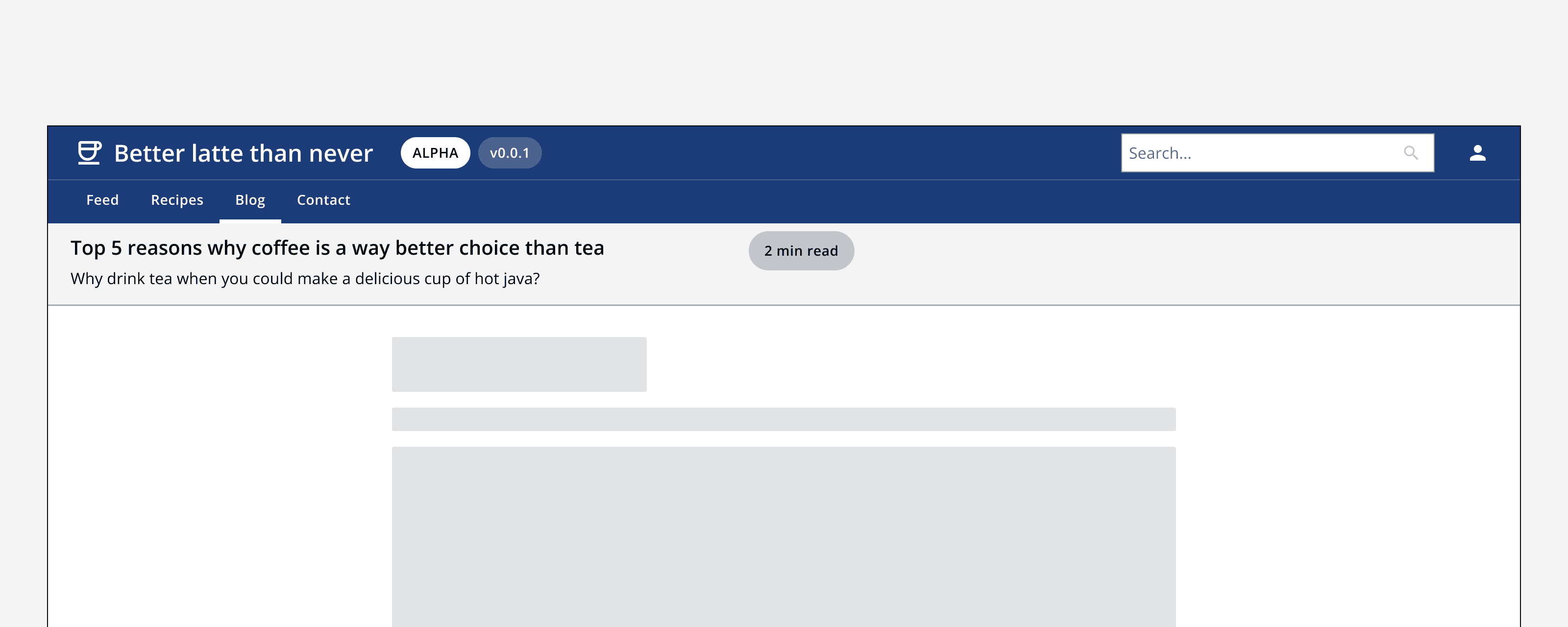
An example app that shows a page header and some example content. The page header’s content is aligned to the left of the screen. The example page content below is aligned to the centre of the screen.
Don’t mix alignments in an app. Here the page header’s content has left alignment, whereas the rest of the page content is centre aligned.

Content

Use short titles that clearly describe the page's content.

Keep page subtitles concise within the page header. If more content is required, consider placing it within the page itself.

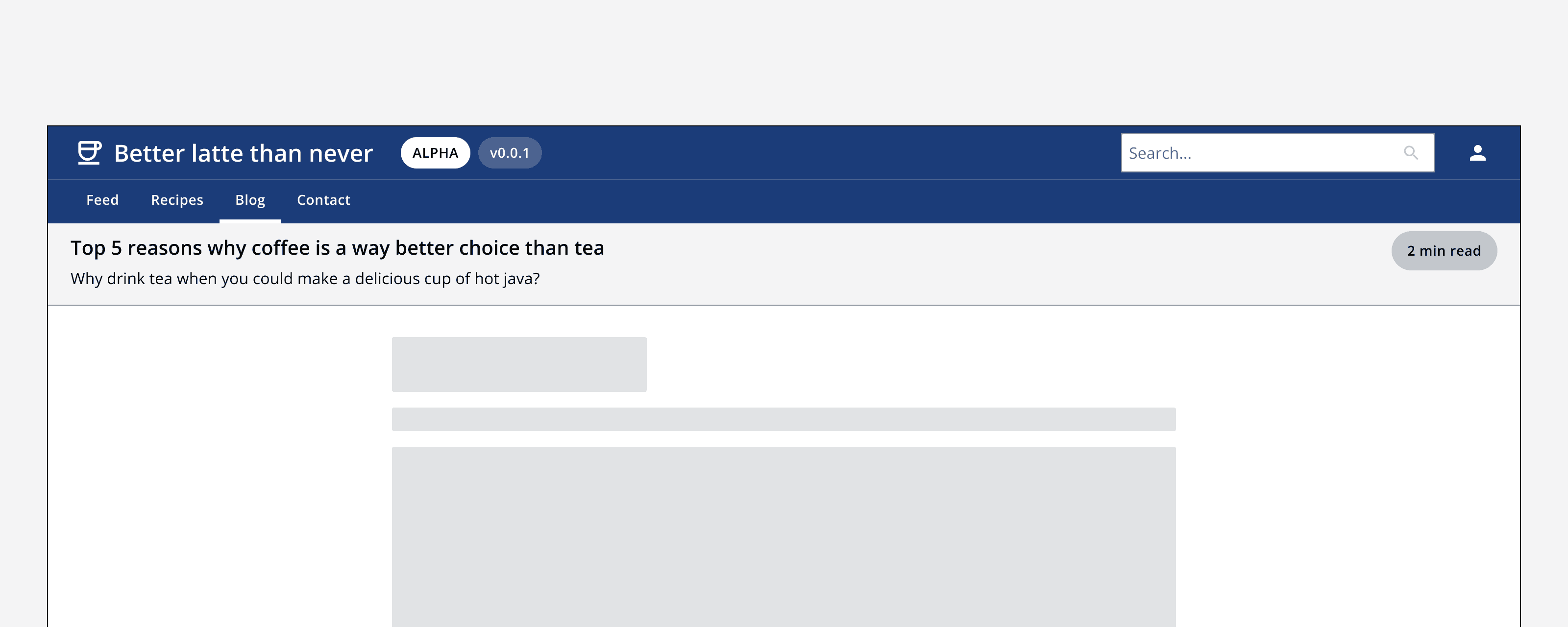
Include a title adornment to convey information such as a status or versioning.


Last reviewed 10 May 2024 .
Navigated to Page header - Intelligence Community Design System