Select
Select
Component variants
There are two types of select component:
-
Single-select
-
Multi-select
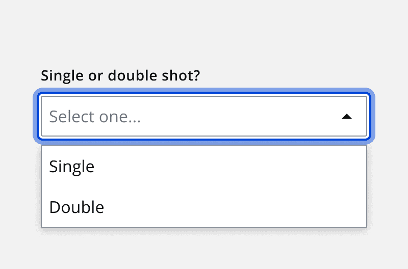
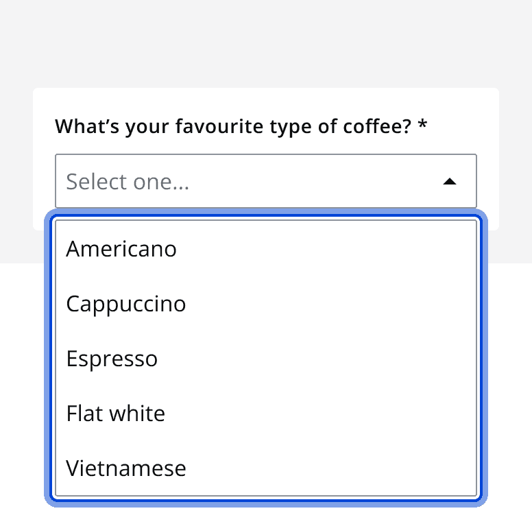
Single-select
An example of the single-select component.
Interactive example
Multi-select
An example of a multi-select component.
Interactive example
When to use
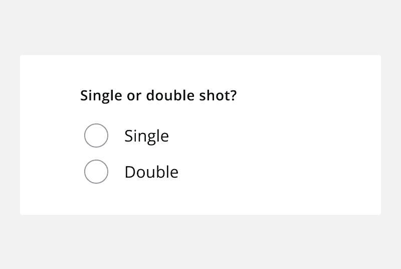
Use the select component to allow the user to choose one or more options from four or more items. For less than four, use a


Validation
Real-time validation helps the user streamline their process and efficiently complete a form. All error validation should be accompanied by an error label.
Content
Option list
The options display a label by default for the option list, which can also include a description or custom elements. Any custom elements used should be non-interactive, such as status tags or icons.
Use a default option list to display all options without any grouping or recommendations.
Recommended
Use an option list with recommendations to display specific options at the top of the list for quick access.
Groups
Use an option list with groups to combine the options into groups with descriptive headings.
Labels
Clear labels help users understand what information they should provide.
Labels should always be visible regardless of the state of the field and should be announced by a screen reader on focus.
Helper text
Helper text should be included when additional information can help the user to either provide the right information or understand why or how the information will be used.
Make sure any helper text that appears under an input is read when an assistive technology user stops at an input using ARIA.
Dismissible inputs
Always allow the user to clear their selection by including a clear button inside the input field.
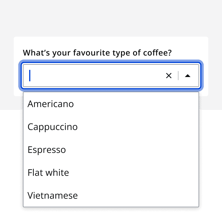
Searchable (single-select)
Interactive example
The single-select component can be set to be searchable to filter options in the option list. A user can open the option list to view the available options, but can also type into the input field to filter the option list to more easily find the desired option.
Use the searchable variant when including several options in the option list, so that the user can quickly filter their desired selection.
Don’t use the searchable variant when providing less than ten options. The added functionality for short lists may confuse users while providing no benefit to their experience.


Content
The component can be configured to show values that either match the search term, or show values that contain the search term. For example, United Kingdom matches the search term ‘Un’, and Tunisia contains the search term ‘Un’.
For searches that take time to load results or suggestions, display the loading state whilst the search is loading. Use the empty state for searches that have no results or suggested options.