Status tag
Status tag
Introduction
The status tag has four types:
-
Neutral
-
Success
-
Warning
-
Danger
Each status tag has a filled and outlined appearance option and is available in three sizes.
Interactive example
When to use
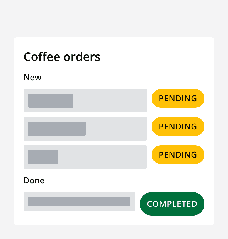
Display a status tag to show the status of an item in an application. For example, status tags could be used to show if a system is online or offline, if a document has been actioned or approved, or if a displayed train network is currently active or not.
Filled
Filled status tags use the status colours to denote the type of status tag.
Use filled status tags to convey emphasis and importance.
Outlined
Outlined status tags use a lighter colour variation of the relevant status colour.
Use outlined status tags to provide emphasis to less important items.

When not to use
Don't use status tags to display anything other than status, use

Don't use a mix of filled and outlined status tags when using them together.

Layout and placement
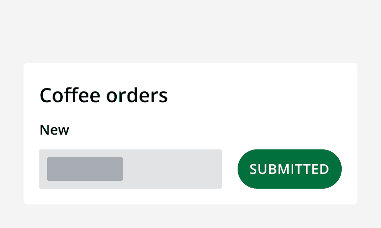
When components are used together the size of the components should match. For example, a medium sized status tag should be used with a default sized input component.


Content
Labels
Use adjectives in the status tag label over verbs. Verbs may indicate to a user that by clicking on them the tag will be interactive.
Text in tags should be all capitals to increase readability.

Use the right status tag type that is relevant to the label. Don't use labels that convey different information to what the status colour conveys.


Use concise labels for better readability. Longer labels will force the text to wrap.