Tooltip
Tooltip
Introduction
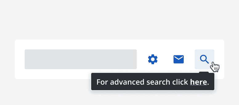
A tooltip wraps around a component and displays a message when the component is hovered over.
Below is an example of the tooltip component on a button.
Interactive example
When to use
When interacting with an element, use a tooltip to provide additional and helpful information.
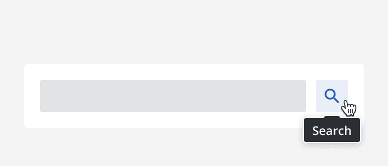
Always use tooltips on icon buttons to provide a textual alternative.
When not to use
Don't use tooltips to provide information relating to anything other than the element the tooltip is attached to.
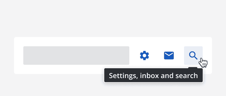
Don't use tooltips to provide vital information to completing a task. Instead, include vital information on the page itself.
Don't use tooltips if its content is unnecessary. Not every element needs to have a tooltip.
Interaction behaviour
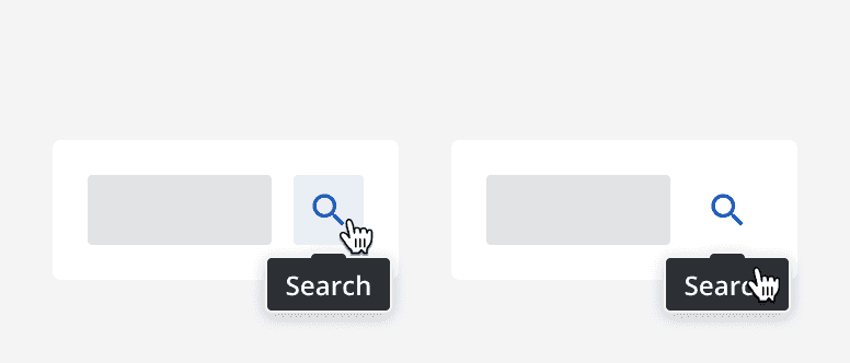
Tooltips are triggered by hovering over its associated element, or by focusing on it. Make sure the tooltip is displayed the whole time the associated element is focused or hovered over.
Moving the pointer over the tooltip's content maintains the tooltip visibility even if the pointer has moved out of the associated element's area.
Sizing
Set the width of a tooltip to contain the content. Adhere to readable line lengths when setting tooltip widths, and wrap content onto multiple lines if necessary.
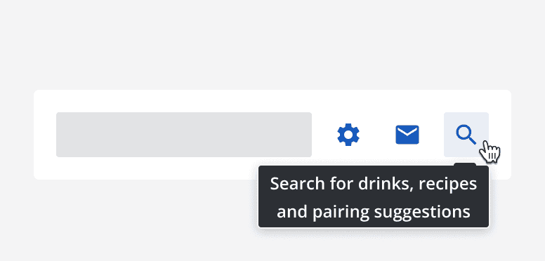
Layout and placement
Avoid positioning tooltips so that they obscure other content. Use the directional options to place the tooltip on different sides of the associated element.
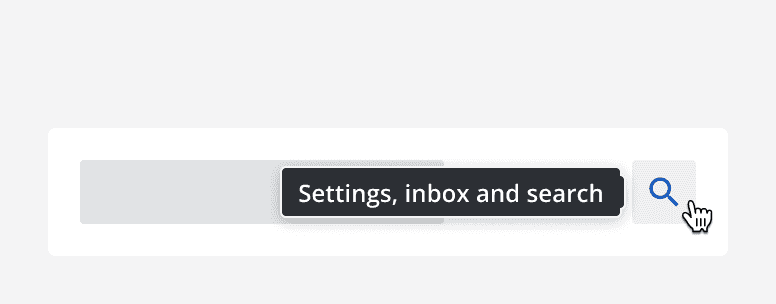
Content
Use short, simple sentences within a tooltip. Don't provide more than one sentence in a tooltip. If a lot of information is required in a tooltip, consider placing it on the page content itself.
Include an icon on a tooltip if it helps to provide additional meaning, but don't use icons if they don't add anything.
Don't include links or other interactive content within a tooltip. If an interaction is useful, place it within the page content.
