Loading indicator
Loading indicator
Component variants
Loading indicators have two variants: radial and linear.
Loading indicators can either be determinate or indeterminate:
-
Use determinate loading indicators when the percentage of completion can be determined.
-
Use indeterminate loading indicators when the process completion rate can't be determined.
Radial
Radial loading indicators have four sizes:
-
Small
-
Default
-
Large
-
Icon
The icon size is available for use within other components.
Interactive example
50%
Interactive example
Loading...
Linear
Linear loading indicators have three sizes:
-
Small
-
Default
-
Large
Linear loading indicators have two variants:
-
Default
-
Full-width
Linear loading indicators can be set to full-width to span its container.
Interactive example
50%
Interactive example
Loading...
When to use
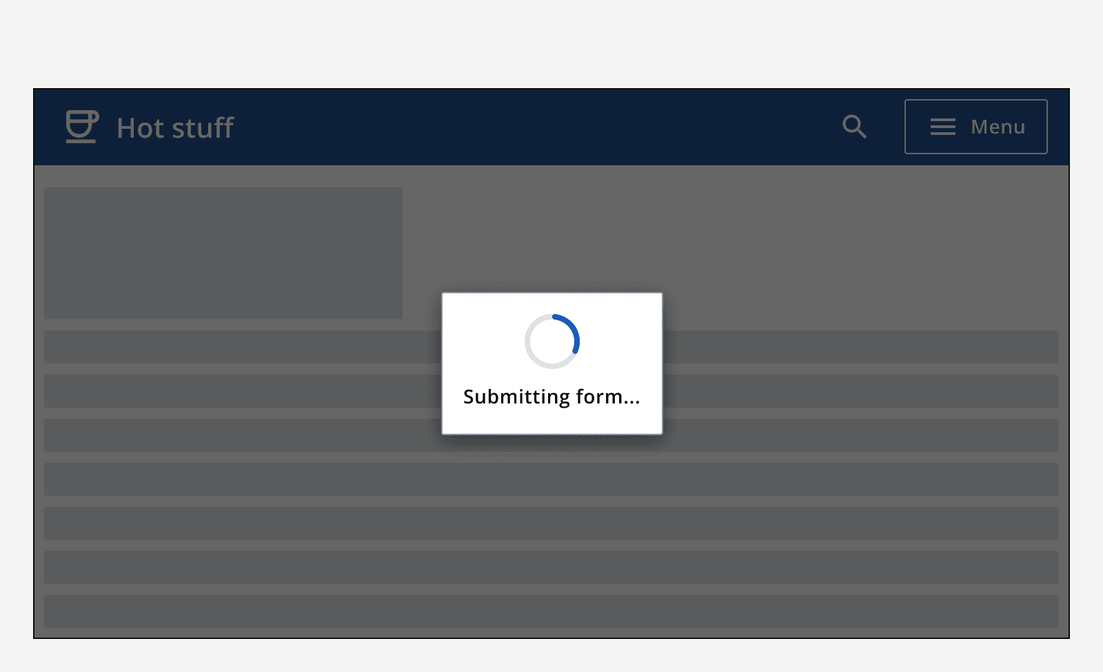
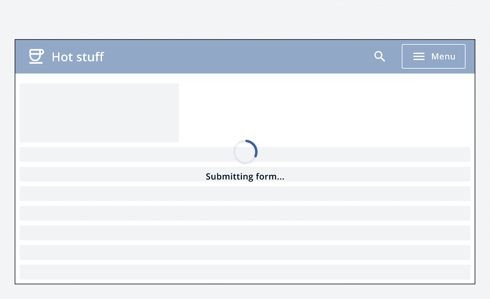
Use loading indicators when loading full pages or containers where the structure is unknown.
Use determinate loading indicators wherever the percentage of completion can be calculated.
When not to use
Avoid using loading indicators when loading full pages if the structure of the page loading is known. Instead, use the
Content
Labels
Determinate loading indicators feature the percentage completion rate in percentage points, 0 to 100%.
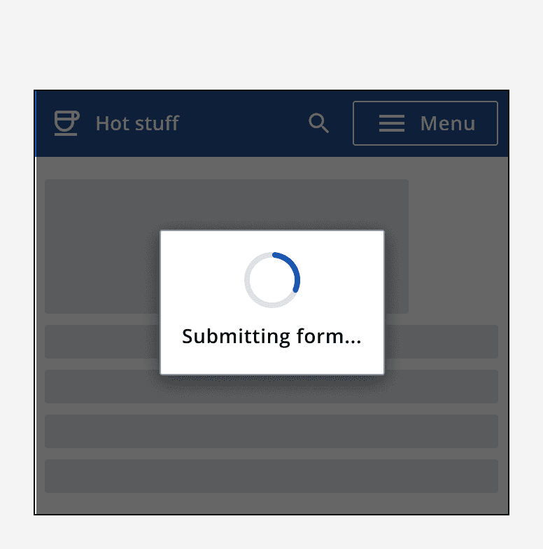
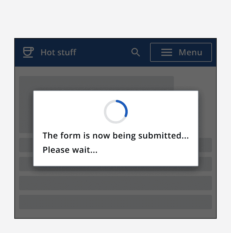
Indeterminate loading indicators have a customisable label. The label can be set to change after a specified amount of time. Make sure to display each label for at least five seconds. Keep labels clear and concise. Where possible, provide specific labels to the process being performed.
Layout and placement
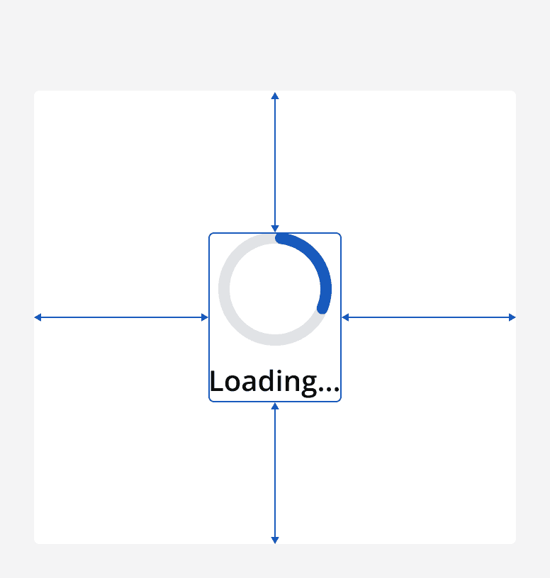
Loading indicators always appear centred within their container. If the whole page is loading, position the loading indicator at the centre of the page. If the loading indicator is used inside another component, like a card, position the loading indicator at the centre of the component.
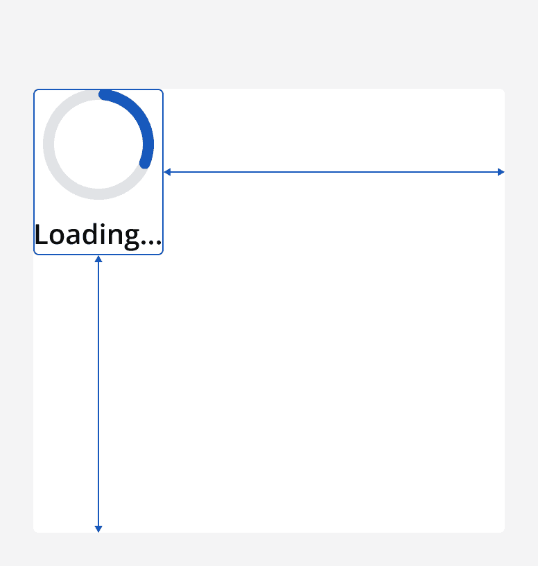
When using the full-width variant of linear loading indicators, make sure to place this at the top of the component or page. Also, make sure that the loading indicator takes up the full width of the component or page.
If loading indicators are overlaid on other content, place them in a dialog.
