Pagination
Pagination
Introduction
Pagination enables large amounts of content to be split across multiple pages so that it is more manageable and doesn’t require overly long page lengths.
Interactive example
Component variants
There are two types of pagination that can be used to control pages of content:
-
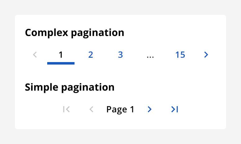
Complex pagination: Contains buttons for navigating to next, previous, first and last pages as well as individual page buttons for adjacent and boundary pages.
-
Simple pagination: Contains only buttons for navigating to next, previous, first and last pages. Displays the current page as a label.
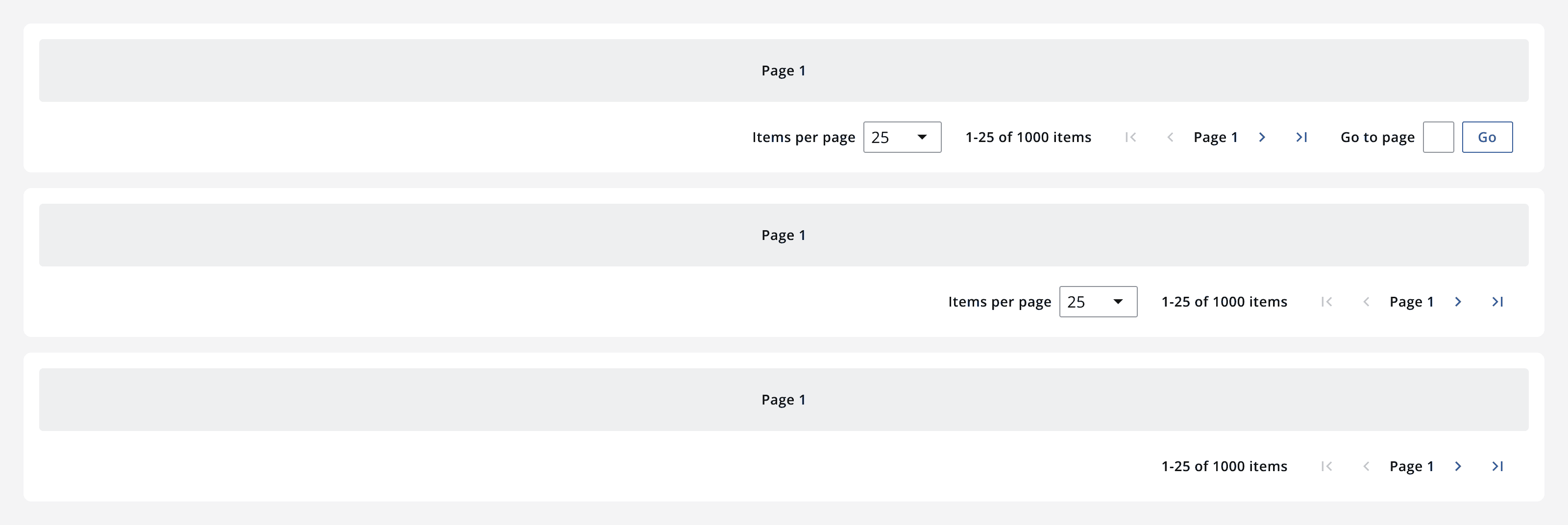
Use the pagination components within a pagination bar to provide other navigation controls including:
-
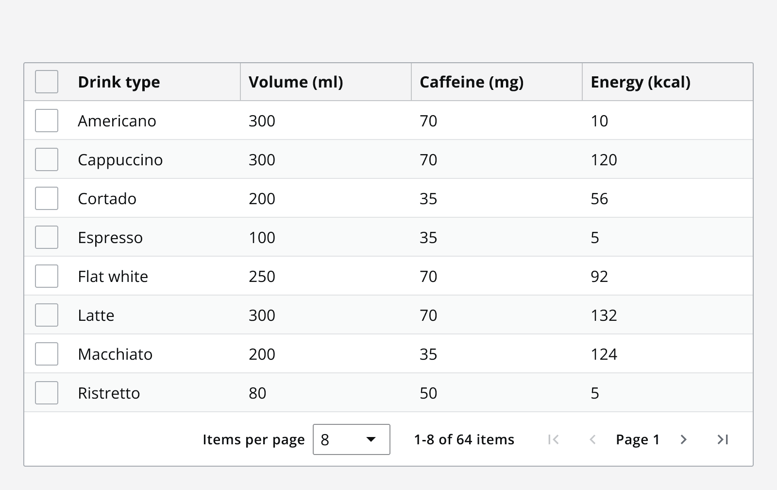
Items per page selector: Switch the number of content items visible per page.
-
Item count: Display the range of currently visible items as well as the total number of items.
-
Go to page shortcut: Allow quick access to any page number by typing the page number and hitting ‘go’.
When to use
Use pagination when you have a large, known amount of content that can be split across pages. Order the content so the most relevant appears on the first page. Pagination works best for lists of content such as search results and data items.
Try to create an understandable order to the content split across pages. This way it is easier to understand what content might appear on a later page.
For example, if content is ordered alphabetically, then it becomes obvious that entries beginning with a ‘Z’ would appear on the last few pages.
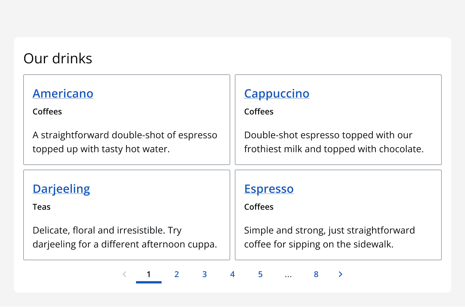
Use pagination for content when there are other elements on the page that can be scrolled to. This means all elements on the page can easily be navigated to without scrolling through a large amount of content.
Pagination provides full control over the content; it allows navigation to any page of content quickly and gives an indication of the total amount of content available.
Use complex pagination to allow people to easily navigate between pages without having to move sequentially through content. This allows people to quickly skip around between pages to search for specific content.
Use simple pagination to navigate sequentially between pages using the ‘next’ and ‘previous’ buttons.
Use a pagination bar to provide more navigation functionality through particularly complex data sets. For example, use pagination bars with data tables to navigate large data sets easily.
When not to use
Avoid using pagination to split up linear content such as articles or blogs. Scrolling down the page makes it easier to consume this content.
Avoid using pagination when the size of the content is unknown or if it frequently changes. This causes the number of pages to change frequently and means it is hard to create a ‘last page’ option.
Use an infinite scrolling pattern when navigating content should be explorative, or when there is a near infinite amount of content. For example, newsfeeds and comments threads can be near endless and infinite scrolling allows exploration by simply continuing to scroll.
Avoid using simple pagination when it is important to be able to move between specific pages; complex pagination is better for this as it shows more adjacent pages, allowing one click navigation.
Interaction behaviour
Pagination components fire an event when a new page is selected. Use this to trigger the switch of pages in the app.
In a pagination bar, when the number of items per page is changed, then the pagination component and the item count updates to show the new number of pages. Make sure to update the pagination component if anything else on the page changes the number of pages. For example, setting a filter may reduce the number of pages required to display the filtered results.
Colour
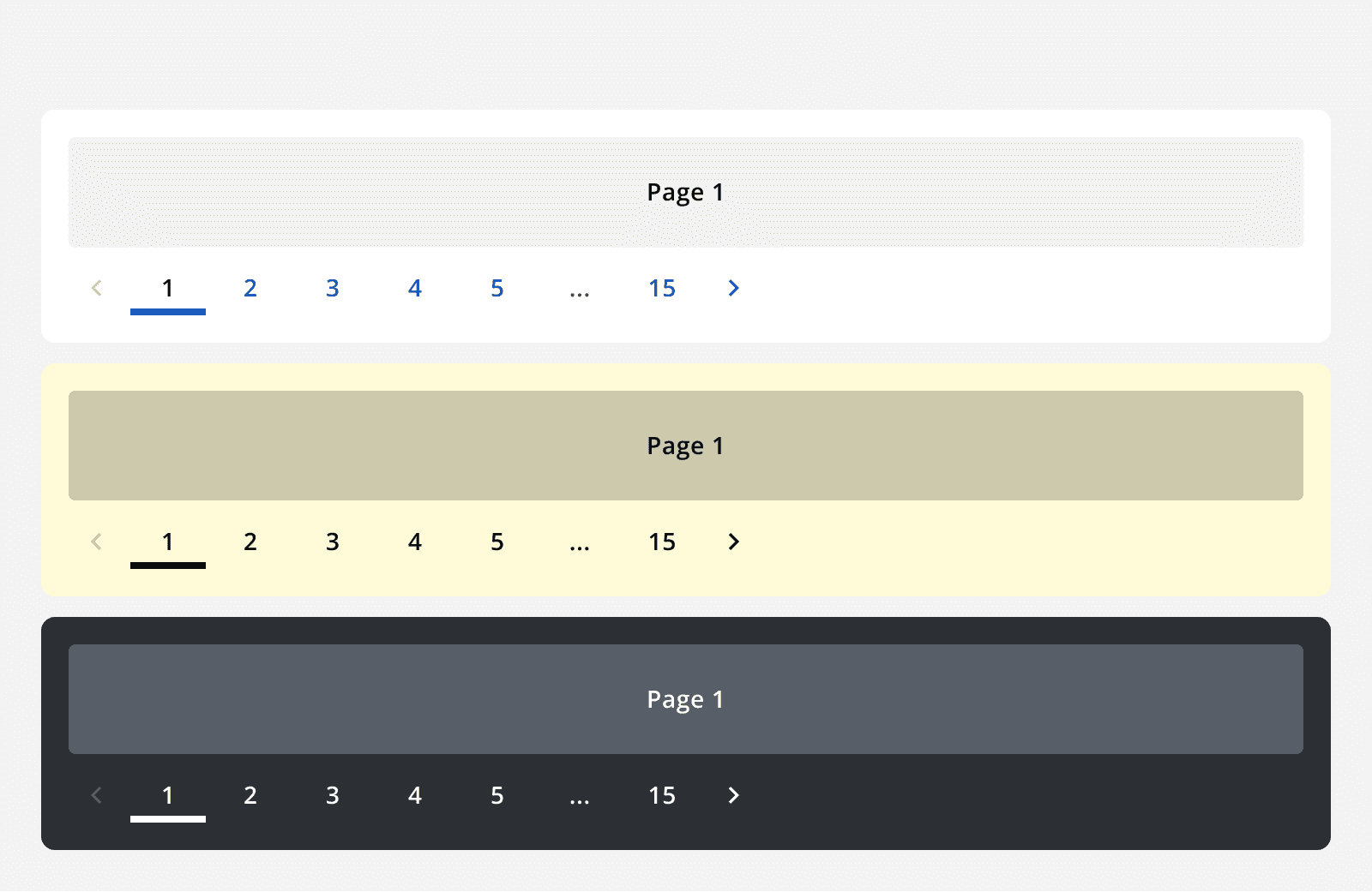
Use the default, dark and light theme pagination withmonochrome={true}
when placing them on different coloured backgrounds to ensure the correct contrast ratios are met.
Layout and placement
Place the pagination component so that it is obvious what it controls. Match the width of a pagination bar to the width of the page.
Try to place pagination at the bottom of the page it controls, as this encourages the user to read through the page before moving to the next. However, placing pagination at the top of the page is still a valid option.
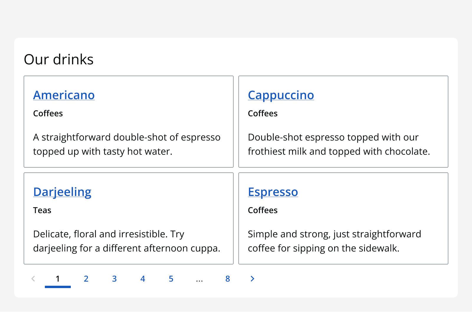
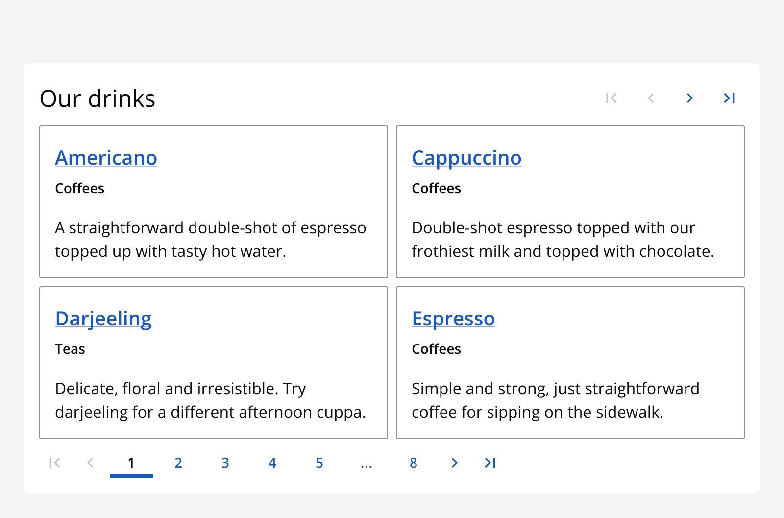
For large page containers that require scrolling, use two pagination components at the top and bottom of the page container to provide easy access to navigation when at either the top or bottom of the page.
Content
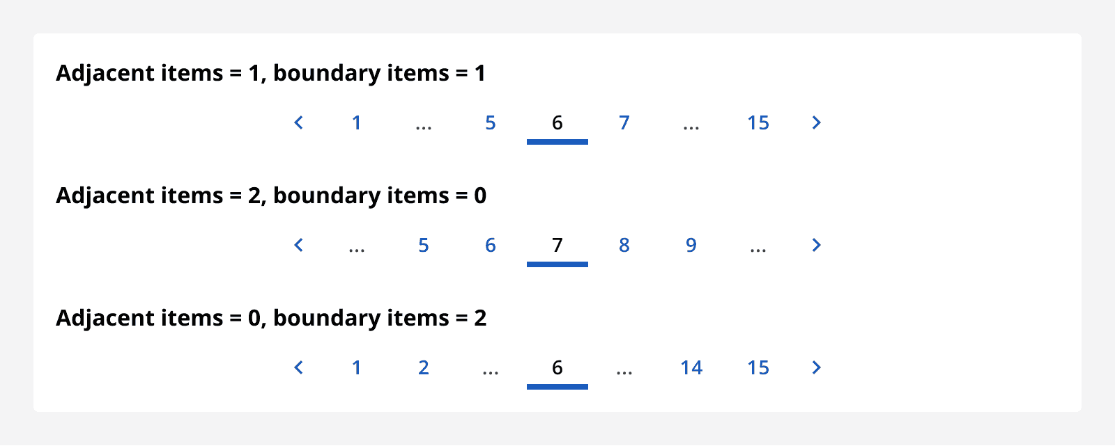
When using complex pagination, specify the number of adjacent pages to display next to the current page. Also specify the number of boundary pages to display at the start and end of the page range.
Select which elements within a pagination bar you want to display. Each element in the pagination bar can be toggled on or off except for the pagination component itself, which can be switched to use complex or simple pagination.
By default, pages are referred to as pages in the pagination component. Override the pagination label to change this. For example, change the term pages to ‘sheets’ if it makes more sense for a data table implementation.