Hero
Hero
Easy to use for everyone
Hero images use text elements that use semantic headings to provide proper order to the page content.
As hero banners can have different colour backgrounds, we've made sure that the foreground colours adjust automatically to ensure that the correct colour contrast standards are met.
Where images are used, alt-text should always be provided to give a description of the image content.
When using images as the background of the hero, safe areas describe where to leave space in an image so that the foreground content is not interfered with.
For Assistive Technology
The hero banner uses slots to allow different components to be added. Where these components are interactive, then their normal focus behaviour is used.
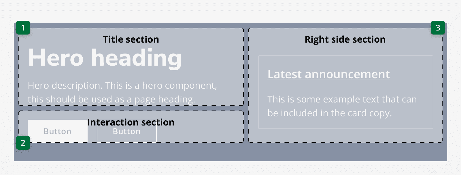
The hero's content is ordered for focus in the following way:
-
Title section including any subtitles
-
Interaction area
-
Right-hand section

Testing
We've tested this component against WCAG 2.2 Level AA. It's been tested with NVDA and VoiceOver, and several different users with different interaction methods.